Telling the Story Behind Hollywood’s Gender Gap Through Data
Problem
A massive film dataset spanning 120 years and 30+ categories needed to be transformed into an actionable, digestible insight. The challenge was twofold: first, identifying the most meaningful story buried in the data, and second, presenting it in a way users could instantly understand without having to search for meaning.
Process
I began by exploring the full dataset across multiple dimensions (actor counts, gender distribution, release years, and genre-level patterns). Through this exploratory analysis, I evaluated which variables told the most compelling and statistically consistent story. I narrowed from 30+ categories down to the core variables that supported one clear narrative: the persistent gender gap in Hollywood. From there, I moved into visualization design, iterating on how to present the insight in a single, intuitive dashboard. I made deliberate decisions about which chart types would best communicate contrast and proportion, choosing a bar chart for raw counts, a line chart for trends over time, and a treemap for genre-level breakdowns, and coordinated them into one cohesive page.
Solution
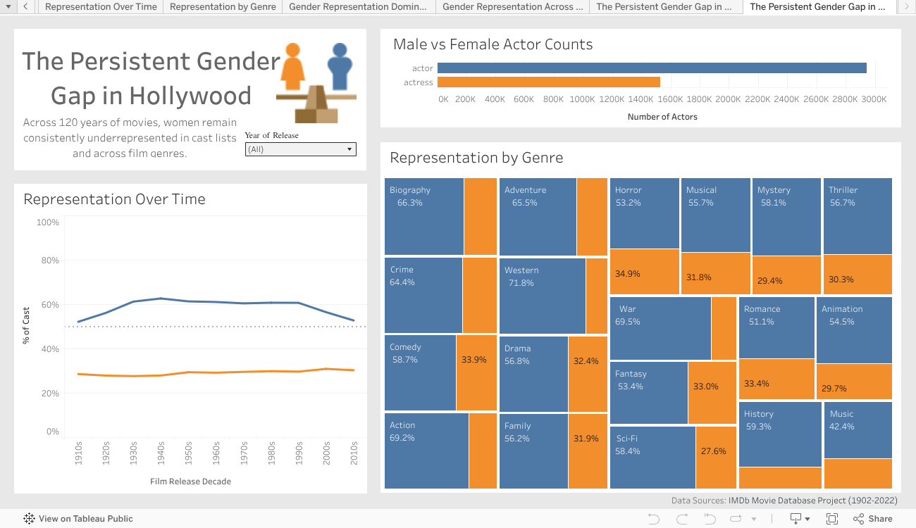
The final deliverable is a one-page interactive dashboard with three coordinated views. The bar chart immediately establishes the scale of the imbalance in raw actor counts. The line chart reveals that the gap has barely shifted over 120 years, with men consistently accounting for 60–65% of casts. The treemap breaks this down by genre, showing that male-dominated genres like Action (69.2%), Western (71.8%), and War (69.5%) far outpace the few genres approaching parity. Color, proportion, and layout do the storytelling; the user doesn't need to search for the insight; it reveals itself.
Impact
The dashboard demonstrated how strategic data curation can turn an overwhelming dataset into a clear, accessible narrative. While formal metrics weren't collected, the project showcases a core UX research skill: identifying what matters most to users and eliminating noise. As a next step, this approach could be extended to test whether users can accurately identify the key insight within seconds of viewing the dashboard, a usability benchmark that would further validate the design decisions.
Tableau Class Project | December 2025