KnowledgeHub Homepage Redesign:
IIBA Information architecture for a 1,500+ page professional knowledge base
Problem
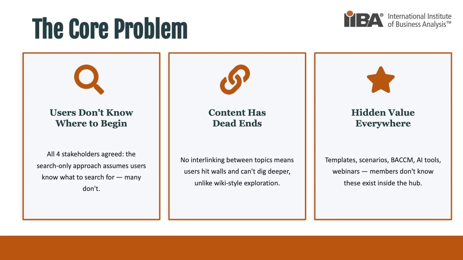
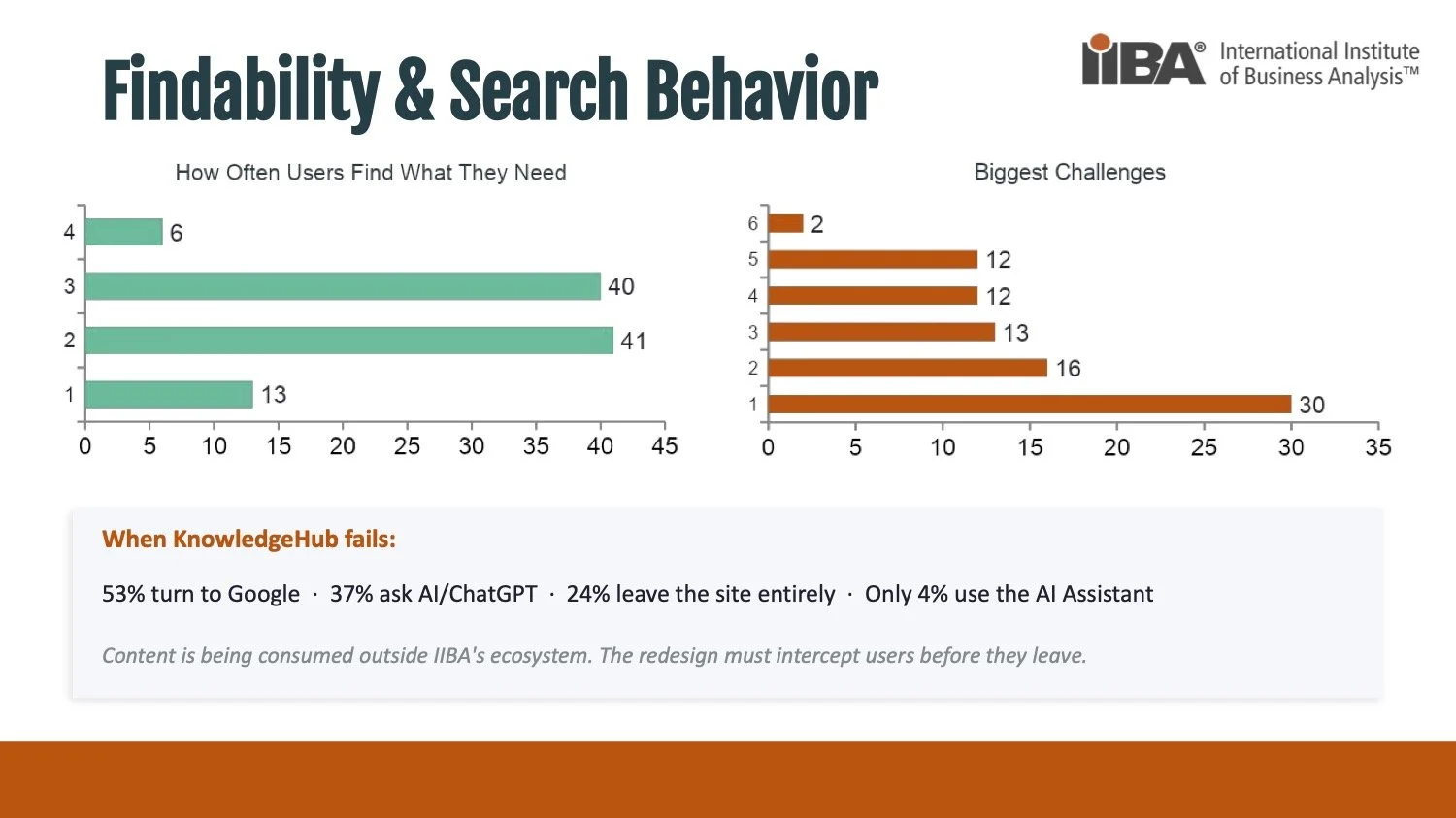
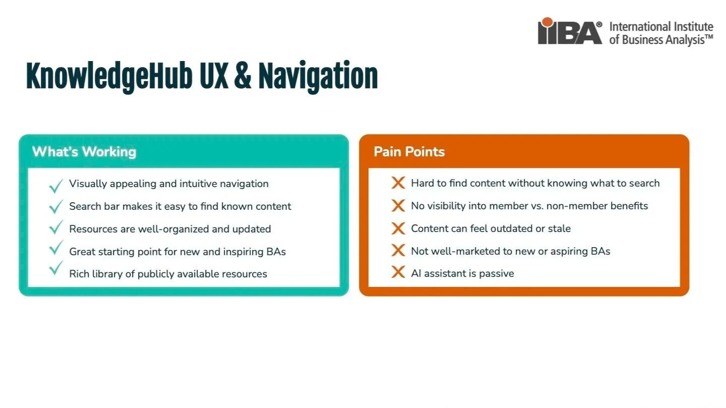
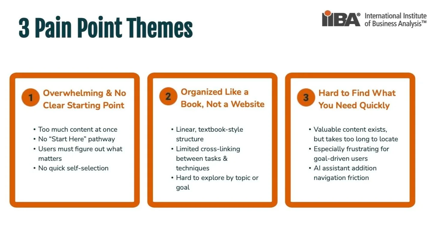
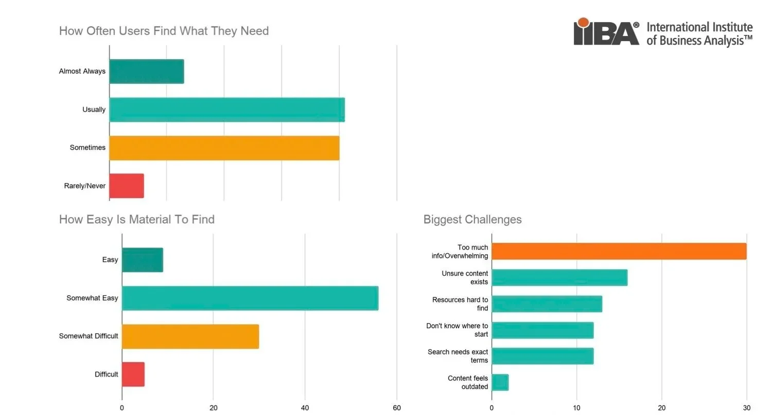
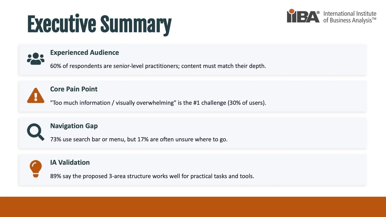
The IIBA KnowledgeHub is the digital gateway to over 1,500 pages of business analysis standards, templates, certifications, and webinars, but the homepage works against the people it serves. It reads like a long, link-dense table of contents rather than a destination, surfacing dozens of links at once with no clear "start here." Much of the genuinely valuable material: templates, scenarios, case studies, the AI assistant, and podcasts, isn't represented on the homepage at all, so members simply don't know it exists. Our survey confirmed the cost: 61% didn't know the AI assistant existed, "too much information" was the #1 reported challenge (30%), and when users couldn't find something, 53% went to Google, and 24% left the site entirely. Authoritative content was being consumed everywhere except inside IIBA's own ecosystem.
Process
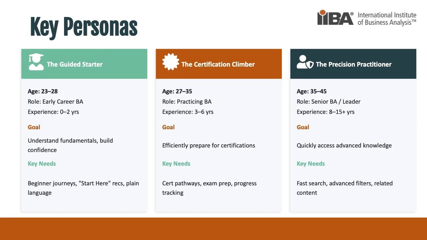
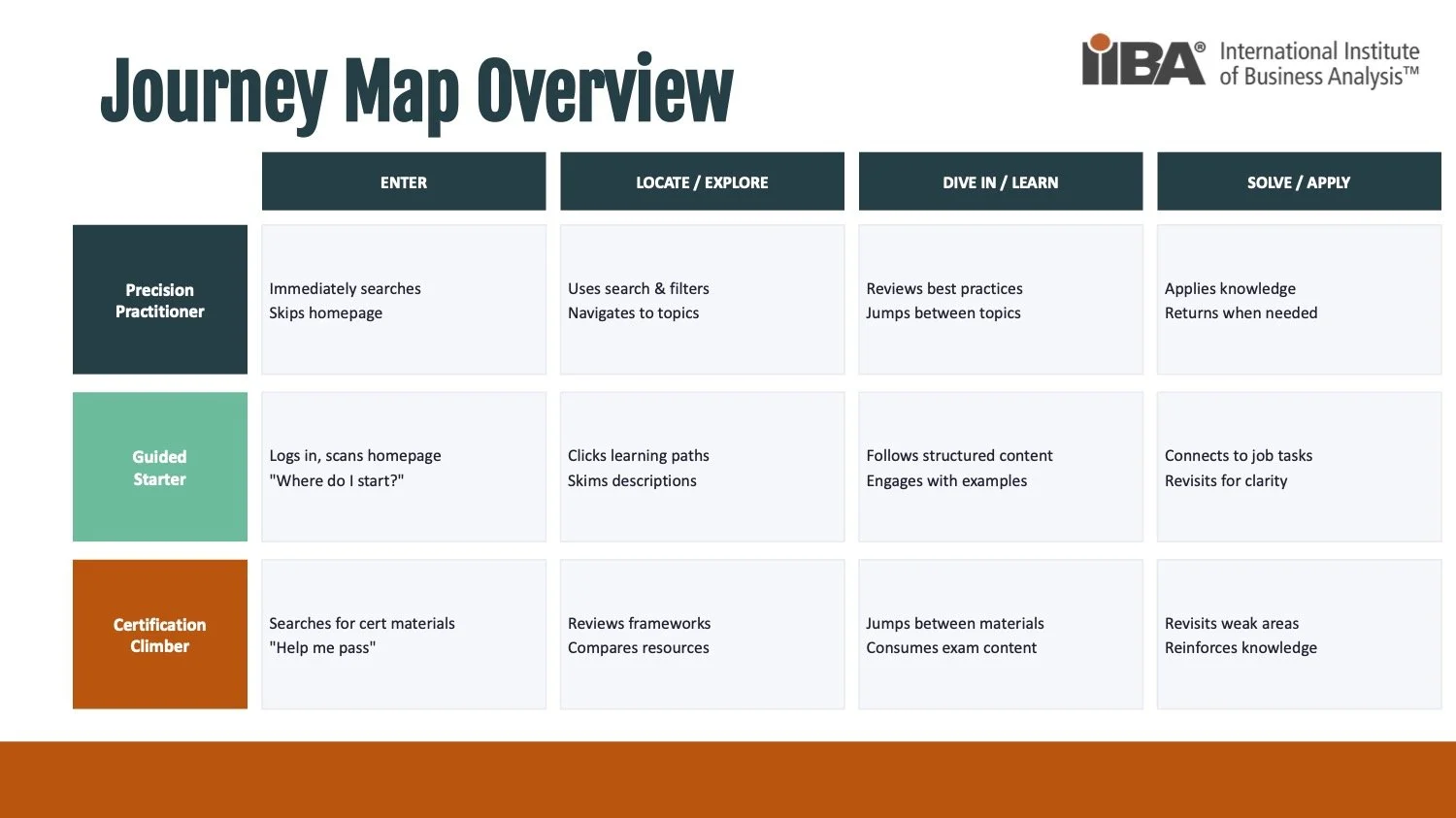
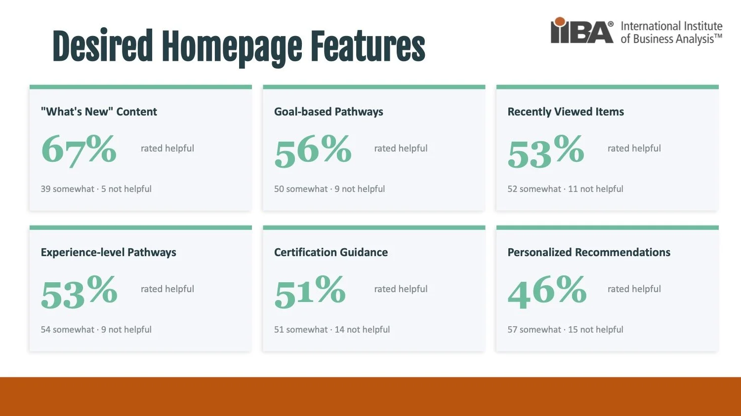
We ran a mixed-methods study and conducted interview sessions to ground every decision in evidence rather than opinion. That included a competitive analysis (PMI, BCS, IREB, IQBBA), a heuristic and accessibility audit of the current site, stakeholder interviews, and a survey with 161 respondents (133 core completions). From there, we built three personas and full journey maps, identified recurring pain points, and translated the findings into prioritized recommendations aligned with established UX principles (information scent, cognitive load, recognition over recall). We then designed and iterated through twelve homepage prototypes, converged on a direction, and validated it: 89% of users said the proposed three-area content structure worked well, before producing the interactive prototype and final handoff.
Solution
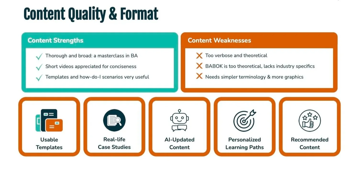
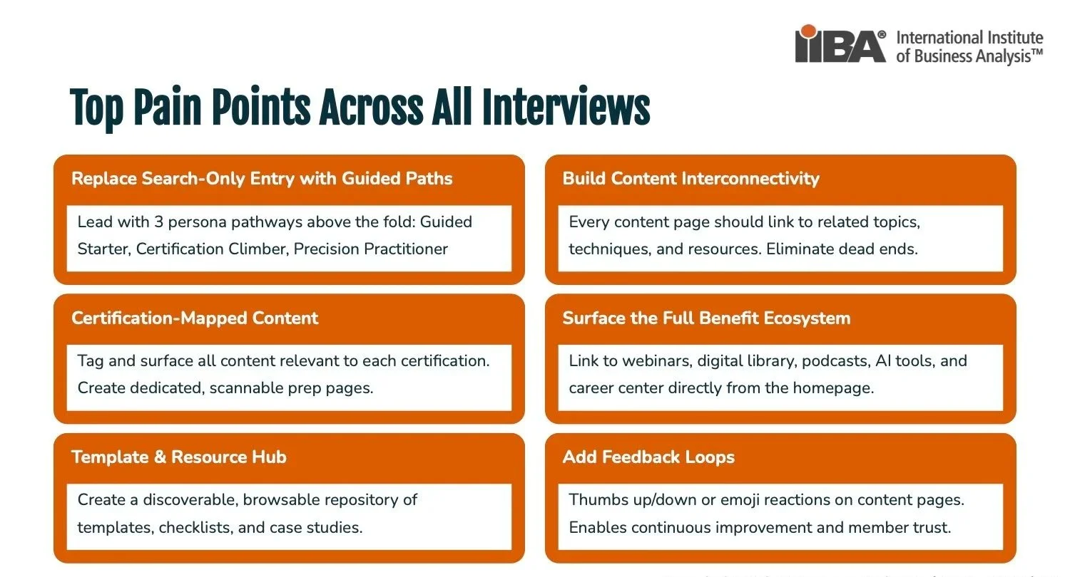
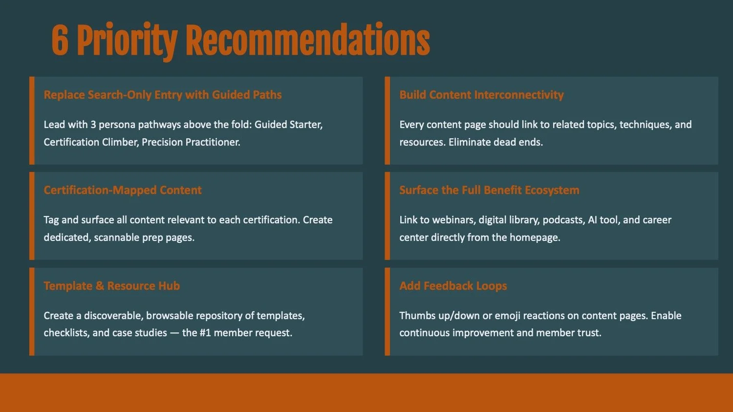
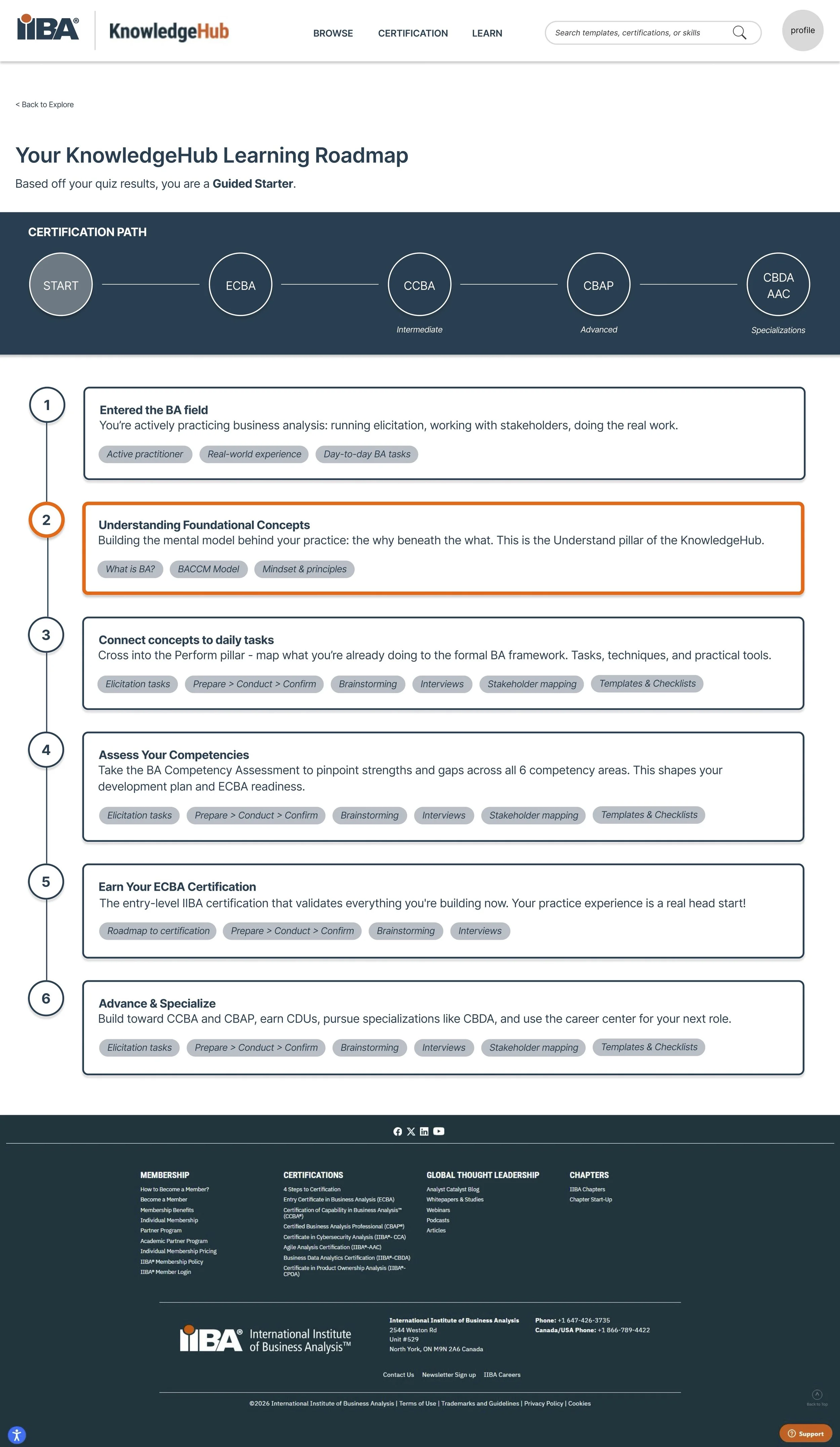
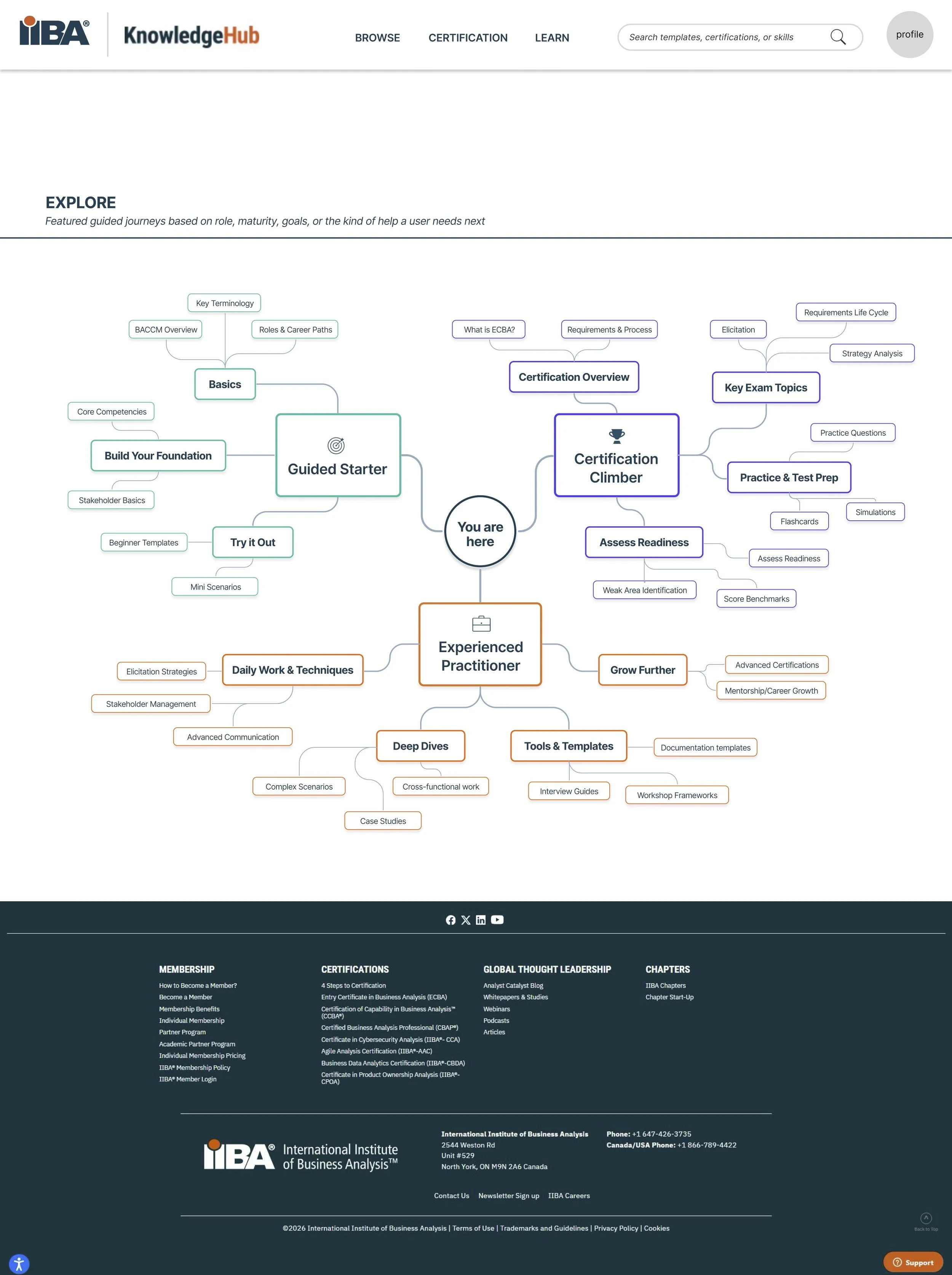
The redesign reframes the homepage from a passive repository into a goal-based router. Persona pathways (Guided Starter, Certification Climber, Precision Practitioner) and an "Explore by Goal" option sit above the fold, allowing users to self-select their intent in seconds. A "You are here" orientation across Learn / Do / Grow replaces the wall of links, and a "What's New" band surfaces recency. A centralized, filterable Resource Library (by skill level, type, and topic) finally makes high-value templates and case studies discoverable, while interconnected content links related topics and techniques, eliminating dead ends. Together, these directly target the three core failures: no entry point, hidden value, and fragmentation.
Impact
The work delivered a validated, build-ready information architecture and a full set of prioritized, evidence-backed recommendations that the IIBA team can act on in phases. Beyond the artifacts, the project reframed how success should be measured, moving away from misleading metrics like time-on-site toward unique member access, repeat-visit rate, drop-off analysis, and renewal attribution over a 90-day post-launch window. The design demonstrably maps to the research: every recommendation traces back to a specific user behavior (e.g., the 73% who rely on search, the 24% who abandon) and a UX principle, giving stakeholders a clear rationale for investment.
My role
We were a three-person team of UX graduate students at Rutgers. I owned coordination and facilitation, acting as the project manager, setting the cadence and timeline, scheduling and running stakeholder interviews and team working sessions, keeping the research and design workstreams aligned, and making sure deliverables came together into a coherent final report and handoff presentation. Alongside the PM responsibilities, I contributed to research, synthesis, IA decisions, design, and the recommendation framework, keeping the team focused on tying every design choice back to the data.
The Redesign
UXD Capstone Class | Spring 2026